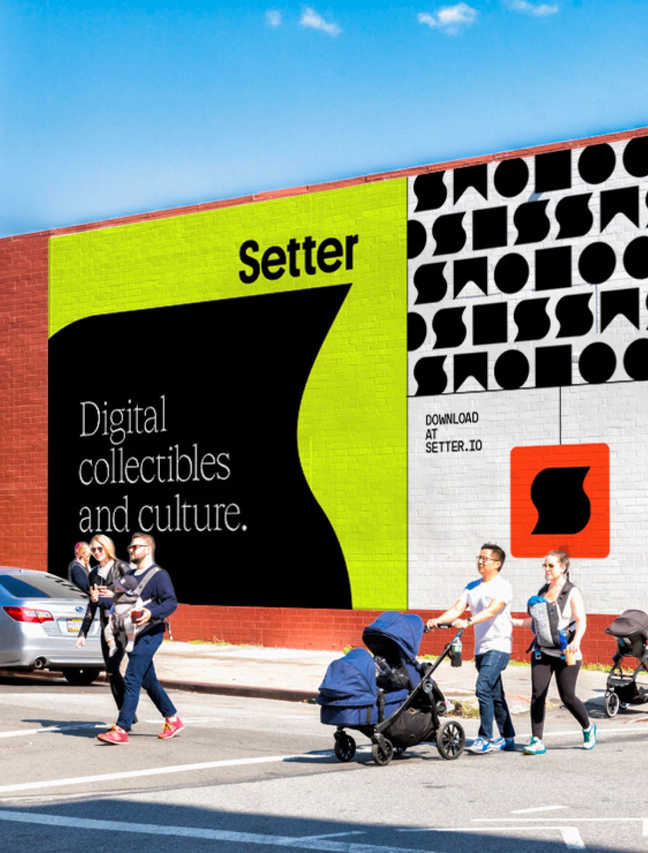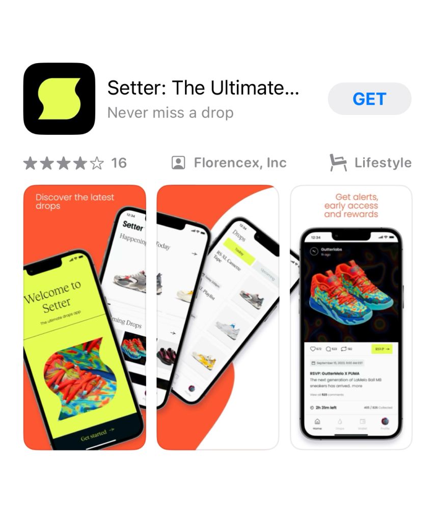


Branding for the app aiming to revolutionize commerce and emerging creator culture.
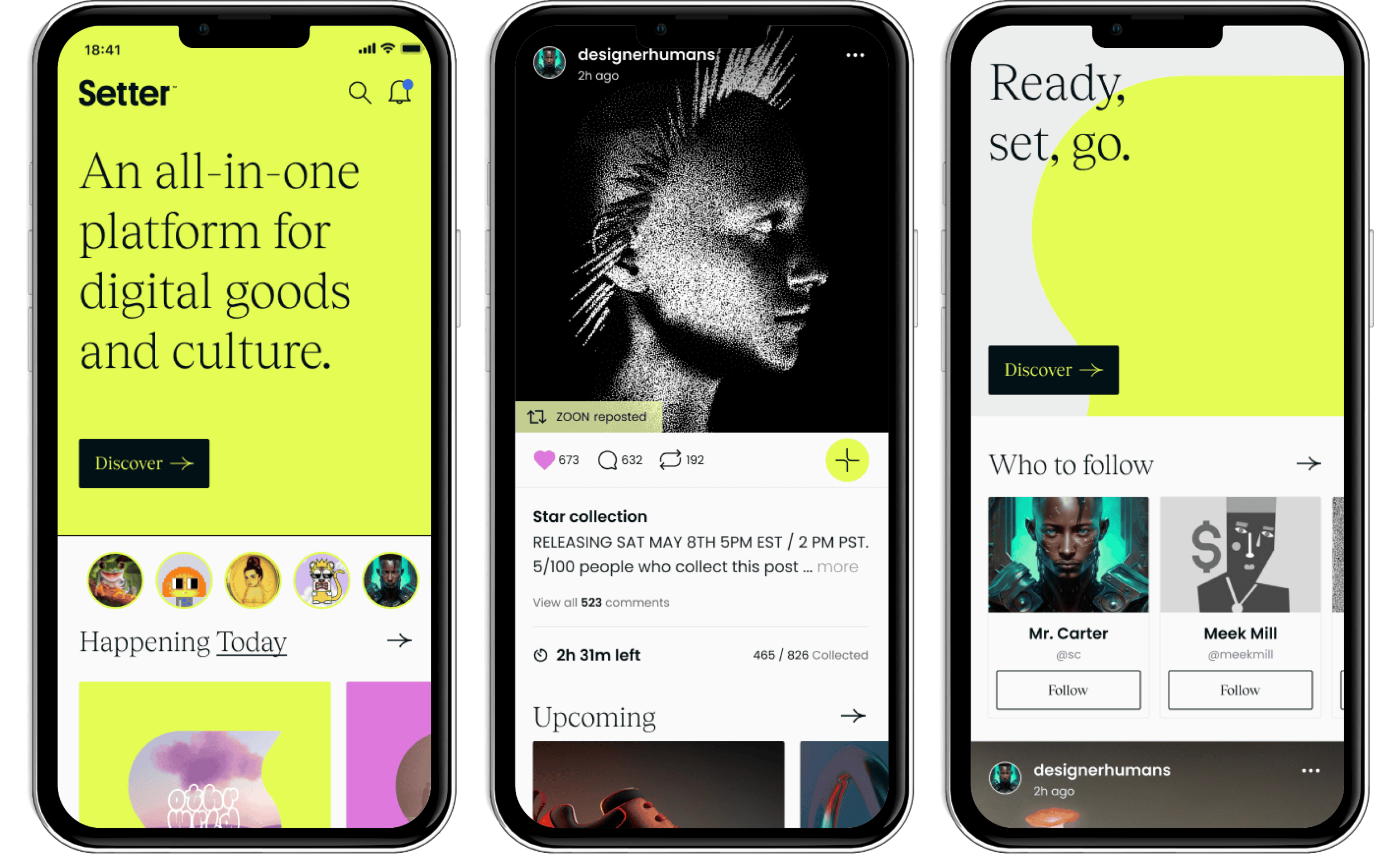
Setter is an all-in-one platform for digital goods and culture that uses the security and efficiency of Web3 to bring the world's biggest brands closer to their fans and collectors. Setter is equal parts digital wallet, social feed and marketplace. Blokhaus was tasked with designing a brand for this digital space where passions come to life, and creativity is the norm.
Setter defines a new category of social commerce, but there was no way to predict precisely how users would make the platform their own – that's the point. So, we positioned Setter's messaging and brand to invite new users in and be a facilitator for their vision. Our client required a brand and messaging system that would grow with its user base and make the best talent in the world proud.


Setter was entering a crowded space; we needed to make it unmissable. We focused on specific, tangible benefits and experiences while elevating the work of creators and beloved brands with a visual system that would make them look great. Our challenge was to make this app an obvious space for users, and a premium platform for brands looking to enter the new phygital category.
What's in a name? Not everything. But this one got us close: Setter. Are you a Setter? Have you checked Setter? Did you see that drop on Setter? We knew that Setter could embody the spirit of creator culture, all while changing the game for how brands showcase exclusive products through limited edition drops. We knew the brand had to define what a “Setter” is, and not just the cool kids at the lunch table, but for the tastemakers who need no credentials.
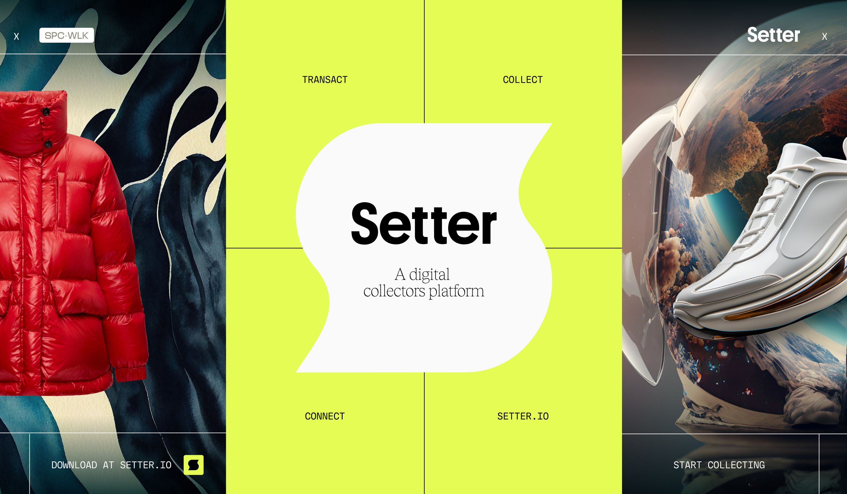
It started with an iconic mark. It's a container and a framing device. It's hard to mess up and hard to miss. It's a bold emblem of cool. We chose a palette of buzzy jewel tones: orange, yellow, red and green. The kind of analogous colors that make your stuff look slick even when it clashes. After much hard work, the brand system did what every sound brand system does: it felt easy. Perfect for brands, creators, and artists searching for the right corner of the internet to amplify their tastes, own their creations, and define who a Setter is on the new internet.
We spent our months with Setter flexing the brand, defining its values, and rallying the core team around a definition stakeholders and users could get behind. We applied the brand to version 1.0 of the app, interrogating UX and UI to crucial user journeys, resulting in a UI kit that could grow into the brand's future.
